
One Room Challenge Spring 2020 ~ Week 2

image via Eye Swoon
Welcome to Week 2 of One Room Challenge Spring 2020! Can’t believe we are 25% into the 8 weeks process, and since Toronto is still under lockdown due to the pandemic (no trades could come into the condo to work on the project), Chris and I have been tackling some items on the to-do list ourselves. More behind-the-scenes footage on my Instagram, and you will find my design plans for my open concept space via Week 1.
One thing I have learned over my past ORC experience (can’t believe I have done 5 already) is that I have got to stay one step ahead of my contractor. Yes he maybe out of commission at the moment but once he’s back in business, I better have all the products / solutions ready for installation. THAT is what I am sharing with you today: wallpaper selection, art curation, and lighting solution.
As mentioned in Week 1, we have purchased the condo 5 years ago … which gave me plenty of time to plan, replan, and do it all again on how I want to layout the space. Here is a quick look at the builder’s plan vs my floor plan:

builder’s plan
direct sightline to the media wall the moment you walked the space
living zone is packed on the left side with a dedicated traffic path to the outdoor space
layout limits the use of space to one purpose: living room + TV (well I guess we could have done built-ins to take full advantage of the media wall)


my plan
sightline looks at a sophisticated living space instead of the media central
extends the living space to the entire space (by placing the coffee table in the middle and breaking up the sofa / chair setup) without blocking access to the balcony
incorporates a desk setup by the window and replaces the chair with a chaise for the ultimate lounge experience
Once I have the layout nailed down, I am now onto the finishes. I am obsessed with grasscloth wallpaper. I have installed a gorgeous neutral paper with a slight lavender undertone in the guest bedroom / home office last fall, and I couldn’t be happier with the subtle texture and its stunning effect.
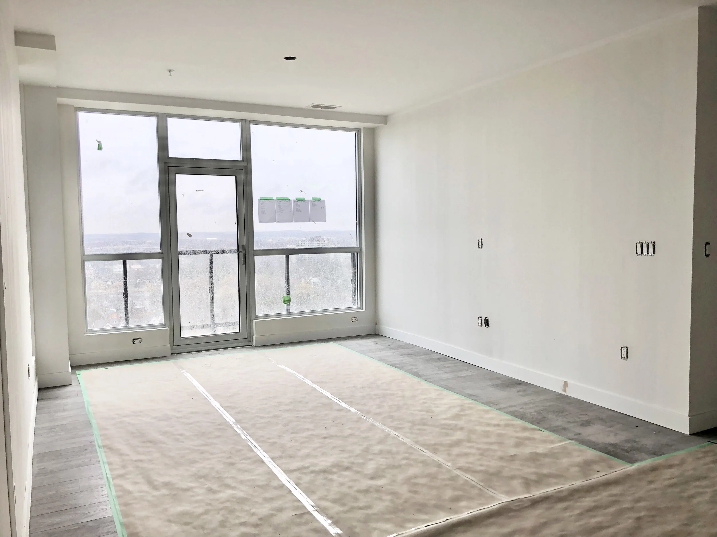

image courtesy of Stephani Buchman Photography
Here are a few more incredible spaces decked out with grasscloth wallpaper, including Chris’ bedroom in his old condo.
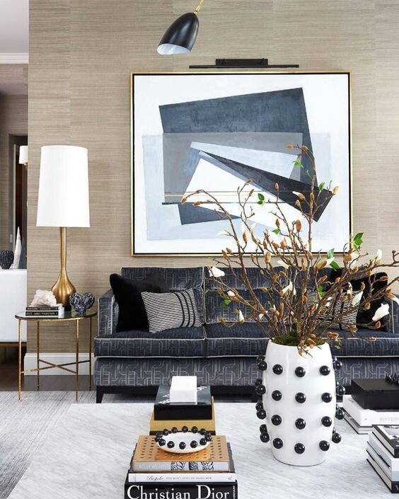
image courtesy of Atmosphere Interior Design, Alex Lukey

image courtesy of Design by Dad

image via Architectural Digest, courtesy of Nate Berkus and Jeremiah Brent
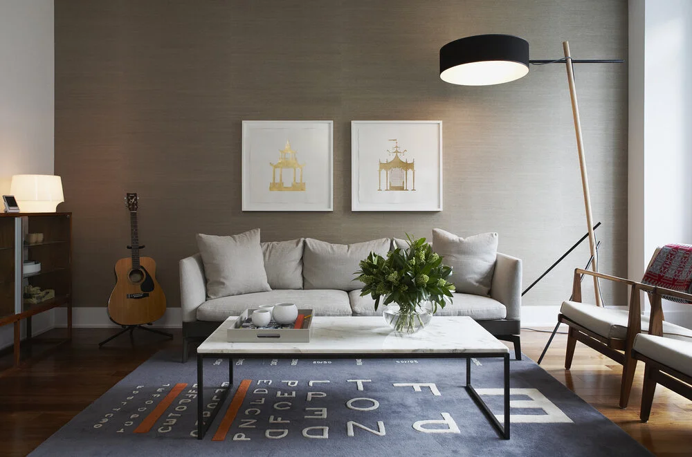
image courtesy of Croma Design
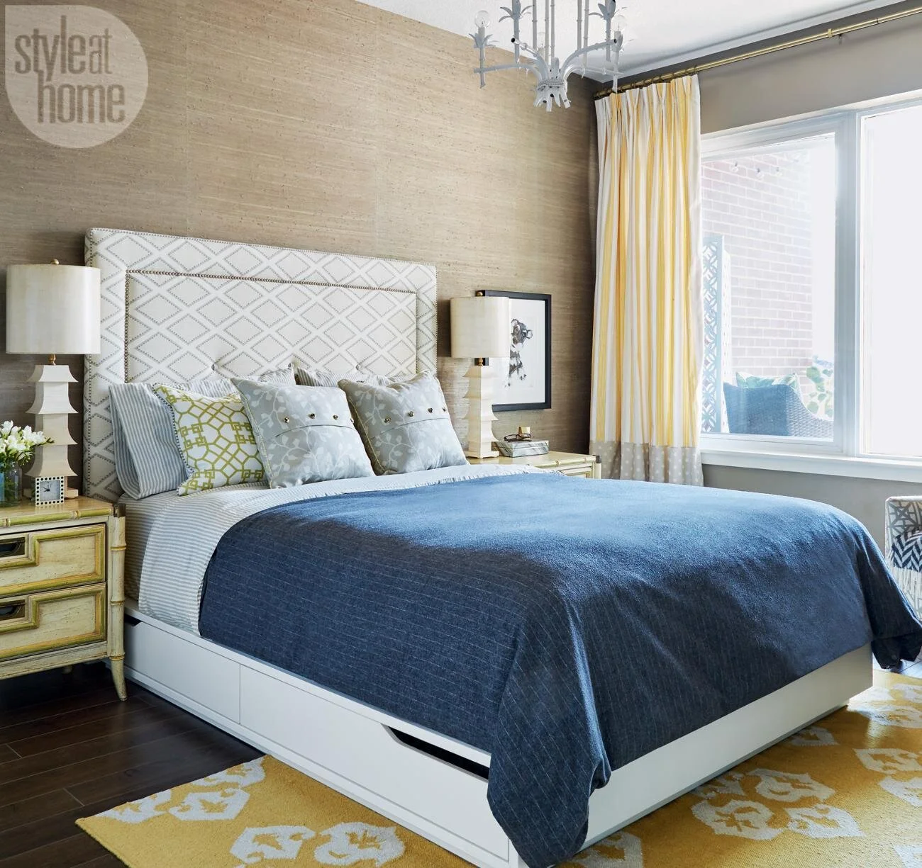
image via Style at Home, courtesy of Donna Griffith
For this open concept space, I have decided to go with grasscloth wallpaper for several reasons:
echoes the same level of finish as the home office / ensuite and offers a cohesive look
creates instant sophistication and a luxurious, shimmery effect in natural light
exudes calmness and a cocoon-like retreat, especially when the paper is wrapped around the entire space
promotes earth-friendly products as grasscloths are mainly made from sustainable crops
Pacific Designs International is an amazing resource for beautiful artisanal grasscloths and silkscreened handprints from Asia. Natural fibers such as jute, hemp, sisal, and reed are harvested, air-dried in the sun, and colored with water-based vegetable dyes before the skilled artisans meticulously hand-weave the natural fibers with lightweight cotton treads together, and then paper backed for strength and smooth installation.
With a large collection of grasscloth at Pacific Designs International, I have narrowed down to about 25 samples and then the 6 finalists. Each of them offers a unique personality, different in texture, sheen, and the way it catches the light. A tip for you when choosing grasscloth wallpaper:
Order samples and tape them up on the wall / room where the paper would go!
Though they all look “white” online, all 6 samples have subtle undertones, not to mention the difference in weave patterns and textures!
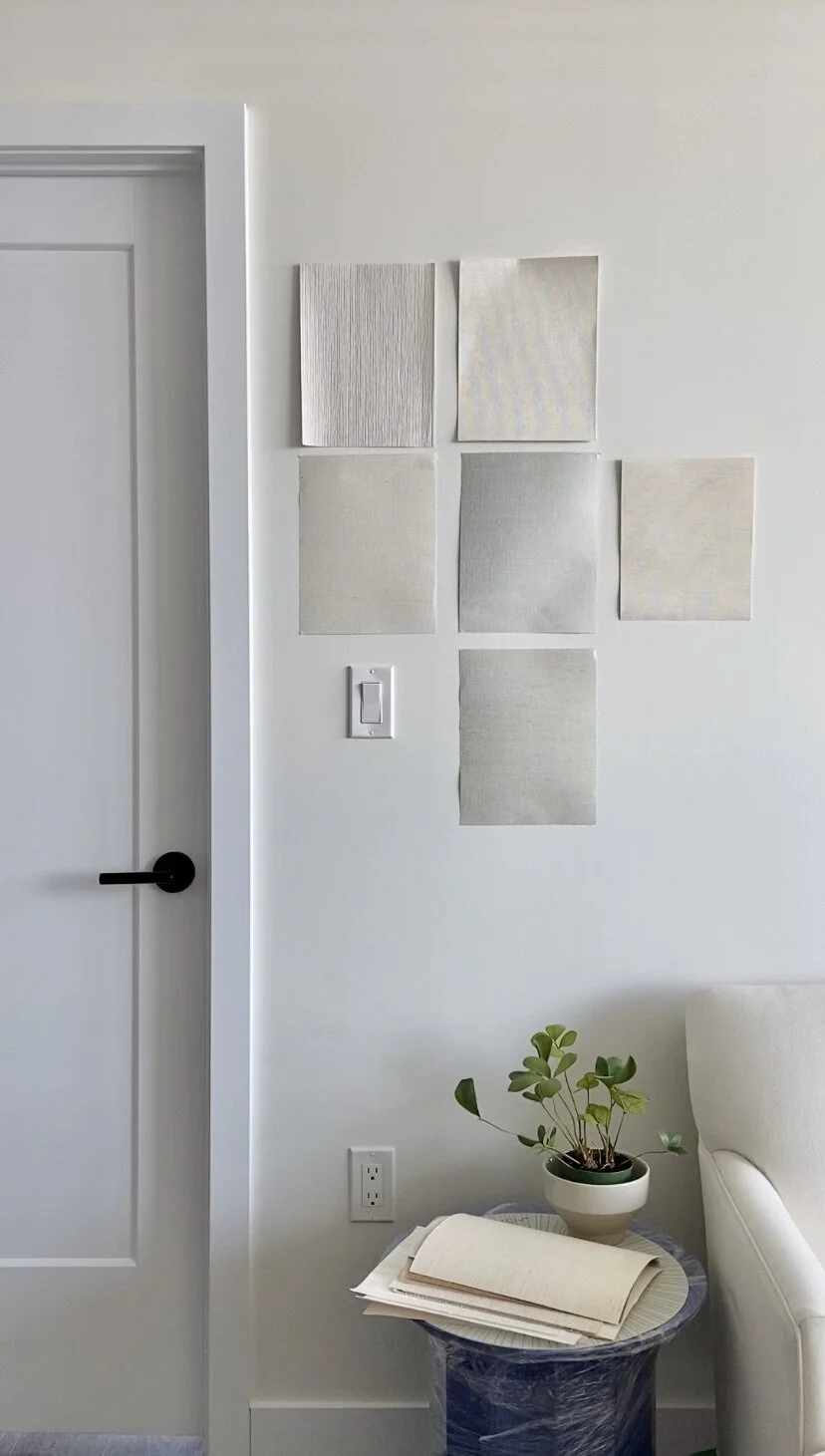

From 6 down to the final 2 and since I love them both, I have decided to use one for the entire living room and one will be the accent for the kitchen wall. I will reveal the final look on wallpaper installation week.


Now onto the next topic of the week: artwork.
Chris and I have collected arts from our favorite artists in town or through travel over time. If our outfit tells people about who we are, then an artwork collection in our home must be our biography. Here is a gallery wall we did at Chris’ old condo:
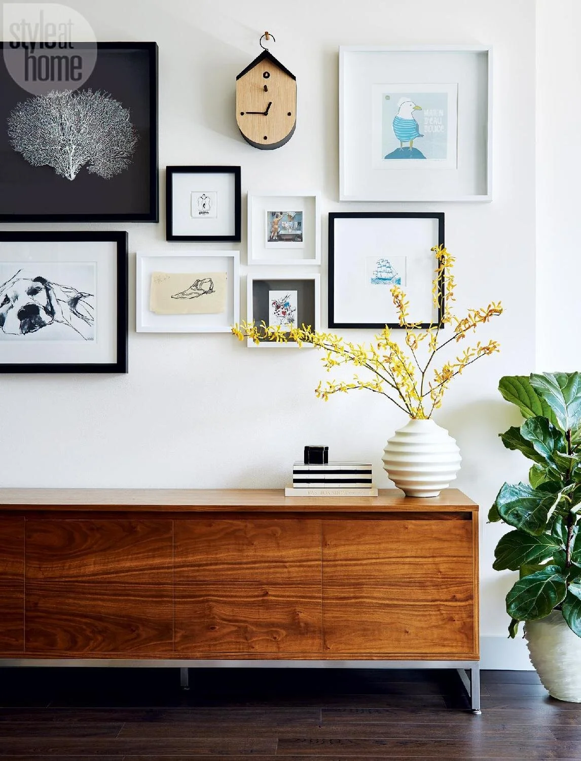
image via Style at Home, courtesy of Donna Griffith
As you can see in these inspiration images, my taste has shifted a bit and I am now very drawn to the muted, neutral tones from framing to objects and the art itself. It gives a sense of calm and an effortlessly elegant look. Even though there are a good number of paintings, photographies, sketches, and sculptures all in one spot, the entire wall is perceived is ONE unit of art.

image courtesy of Shelby Girard
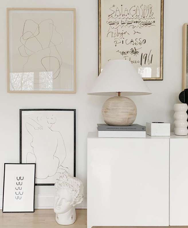
image courtesy of Shannon Claire
For my living room, this is the wall where we plan to showcase our art collection (mixing treasured pieces + new favorite to reflect my current taste).
For limited addition prints that are good quality, responsible to the budget, and to support artisans around the globe, I immediately thought of minted. From limited fine art prints to oversize wall murals, minted offers art lovers and artisans a platform to meet and to bring home a piece (or a few) to complete your home.

images via minted
With over 3,000 options for fine art prints alone, it could be challenging to finding the piece you love and to know that it will work in your home. But don’t you worry because you are not alone … we all feel the same way and here is my approach:
filter the selection by theme or color palette to narrow down your options
gather all the pieces that caught your eyes and put them all in one spot (ideally a mockup of the room where the art would go)
play with the the scale of the pieces, which is a huge benefit for shopping at minted because most of their prints are available in a variety of sizes, finishes, and framing options
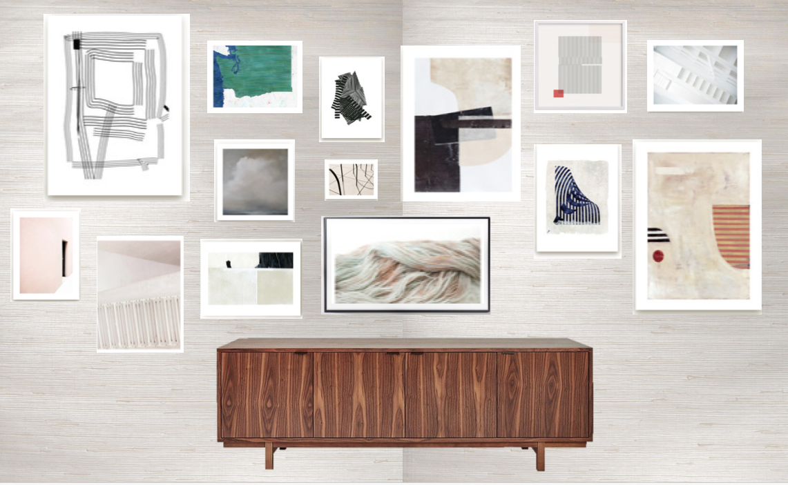
Knowing that I want the gallery wall to be muted and unified as one single focal point, I have narrowed down my choices to 5 with one I already own (on the far right).

AND just to make sure everything fits on the wall and the scale looks right in real life, I pulled out the good old craft paper and a pair of scissors for a dry fit. I highly recommend this process before you place the order, especially when you are trying to determine if the collection has the right mix / size.


Fast forward to present days, our artwork from minted have arrived. I opted to have two large pieces framed via minted, and I am very impressed with how well packed the piece were for shipping. The hanging hardware worked like a dream and Chris were able to put the pieces up in less than 10 mins!

From black and white geometric prints to architectural capture in shades of pale mauve, I can’t wait to have this limited print by Teressa Lang specially framed. Fingers crossed I could get my plan going soon after the lockdown.


One more element I want to share with you today is my obsession with geometric shapes … so naturally I am in LOVE with this image from RUM International. Arches, oversized cone-shaped pendant, sculptural furniture pieces, and vibrant orange stripes on artwork, I simply couldn’t get enough!

image courtesy RUM International
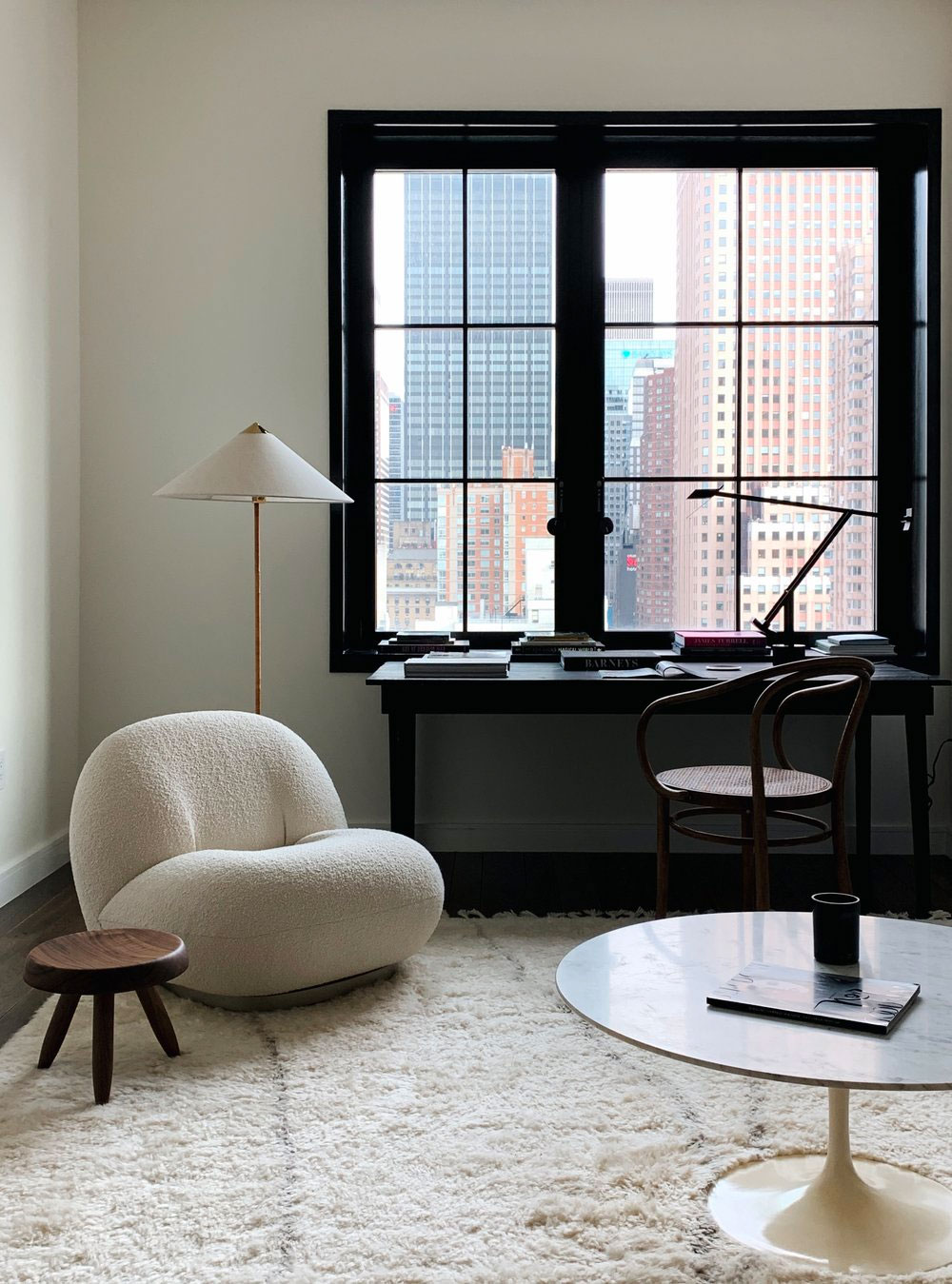
Getting back to reality, I have been eyeing a similar floor lamp as seen in Colin King’s home (an incredibility talented stylist in NY) and of course in the sumptuous bedroom of Athena Calderone.

image via Nordic Design, courtesy of Colin King

image via Eye Swoon
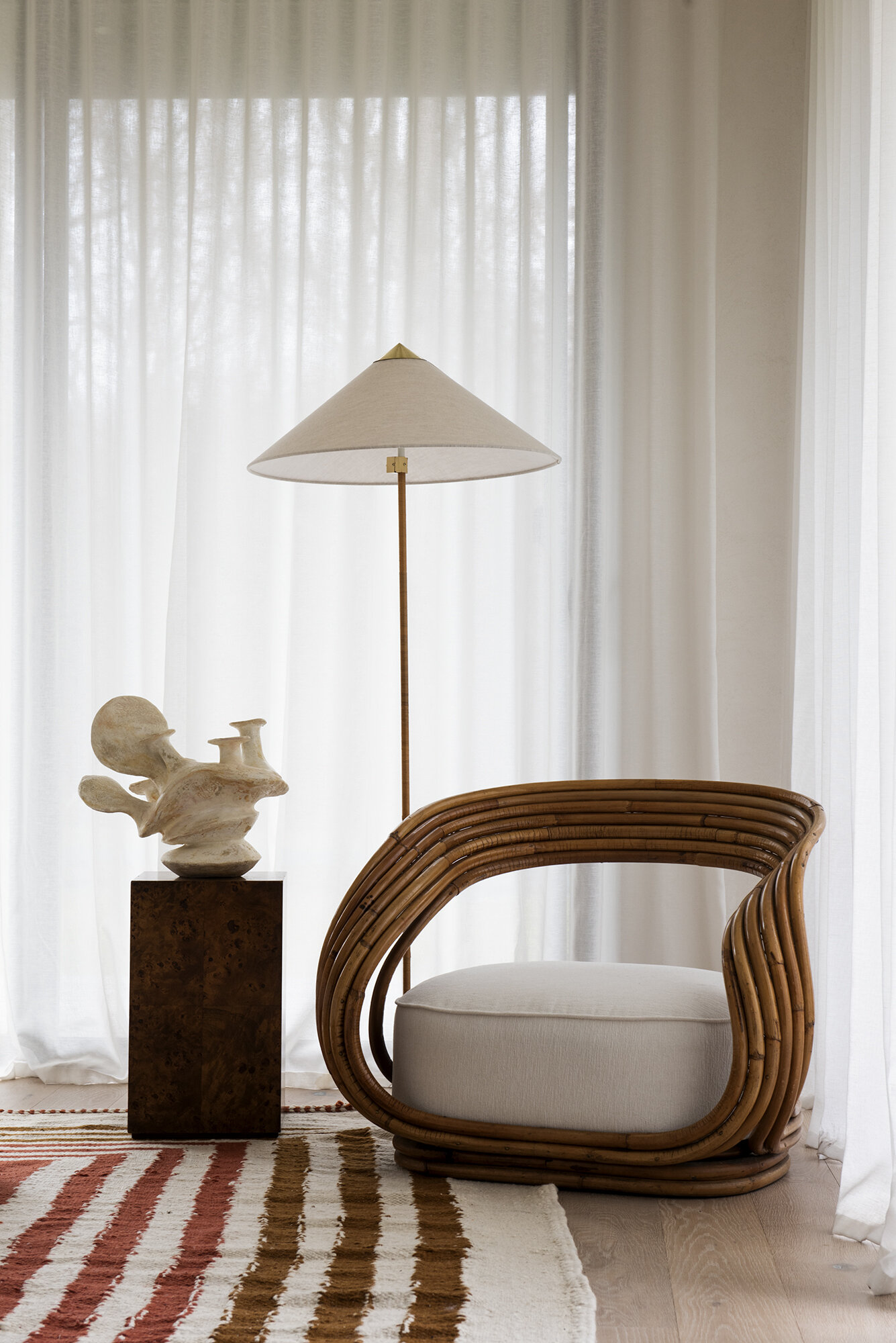
image via Eye Swoon
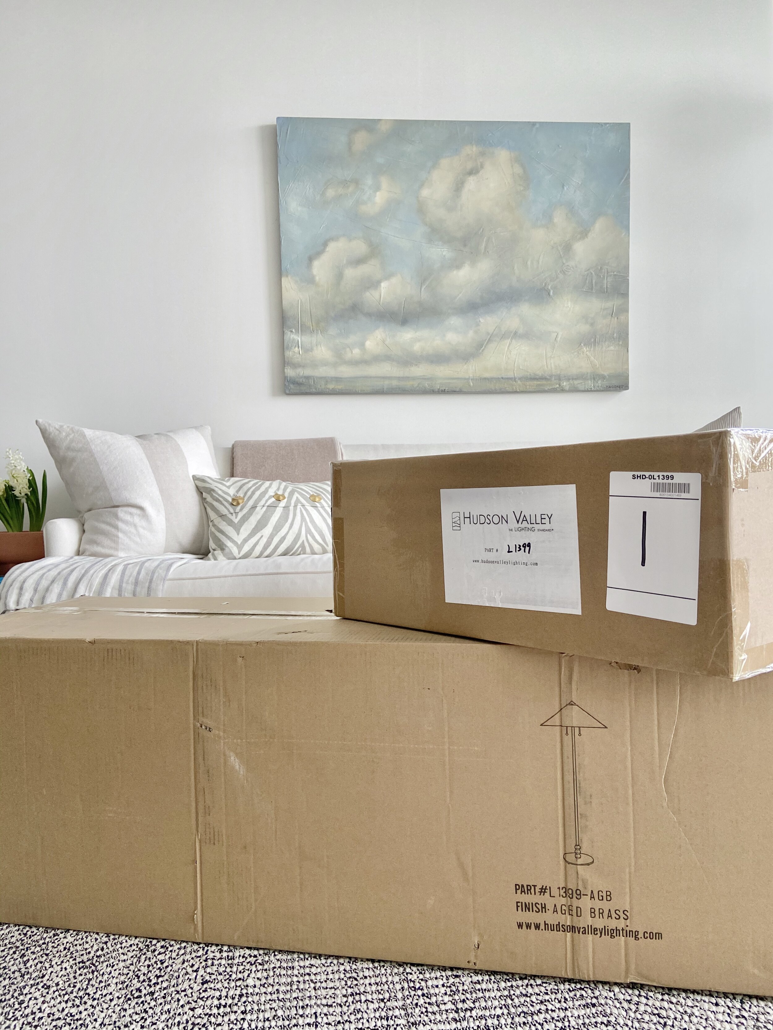
So you could imagine my excitement when I spotted the Flare floor lamp at Hudson Valley Lighting. It has a similar cone-shaped shade (which is extremely important to me) and a rattan / aged brass accent throughout. The Belgian linen shade is not only beautiful to the eyes, but also very well constructed and luxurious to touch. The aged brass finial is of top quality with substantial weights.
I wish I could show you Chris’ excitement when he first saw the fixture but I could tell you how over the moon excited I am with the way it looks in the living room.


That’s it for Week 2. A lot more to come over the next 6 weeks and now it’s time to check out the featured designers and guest participants on their projects!

A Glass of Bovino | Beginning in the Middle | Beth Diana Smith | Clark + Aldine | Coco & Jack
Deeply Southern Home| Design Maze | Dwell by Cheryl | Erika Ward | Home Made by Carmona
House of Hipsters | Hunted Interior | Kandrac & Kole | Kate Pearce | Katrina Blair | Liz Kamarul
Veneer Designs | Rambling Renovators | Renovation Husbands | Studio Plumb | Media BH&G
Big thank you to the official One Room Challenge sponsors for providing me with your amazing products we showcased this week:
grasscloth wallpaper: Pacific Designs International
artwork: minted
floor lamp: Hudson Valley Lighting
Be sure to follow along on my Instagram for more project updates and behind-the-scenes footage for week 2 of ORC Spring 2020!