
One Room Challenge Spring 2020 ~ The Reveal!

Welcome to Week 8 of One Room Challenge! What a ride this time around to complete the makeover during a global pandemic + with our hearts in deep sorrow as we continue to listen, learn, and act to eliminate racial injustice. This transformation surely wasn’t a walk in the park as nothing happened as planned and then the renovation came to a complete halt in April. Thankfully, Linda, our thoughtful and supportive #ORC leader, decided to postpone the event by a month and gave all of us 8 weeks (instead of 6) to tackle our project. I am very grateful for the extra time, and I am sure all of you share this sentiment and gratitude for Linda and the ORC Team.

First of all, for those of you who are new visiting Design Maze, my name is Tim Lam, an interior decorator based in Toronto, Canada. This is my 6th One Room Challenge and a BIG thank you to Linda and to Better Homes and Gardens, our official media partner, for having me as one of the 20 featured designers for ORC Spring 2020. And thank you, Stephani, for capturing these beautiful images for the Reveal.
I LOVE streamlined contemporary spaces with a good mix of patterns plus pops of color as accents. There is always a sense of whimsy and an appreciation of natural elements in my design. In case you are curious of my design aesthetic, check out my Instagram page + my portfolio for my previous One Room Challenge makeovers.
For #ORCSpring2020, Chris and I are tackling an open concept living room / dining room / kitchen in our brand new condo. The view from our new home is impressive. But like most small space living, how do we maximize both fuction and usage of the existing space without a major overhaul? Luckily, we bought our condo at pre-construction and were able to make some customizations.
Here are the recaps of our weekly journals:
week 1 / 2 / 3 / 4 / 5 + 6 / 7
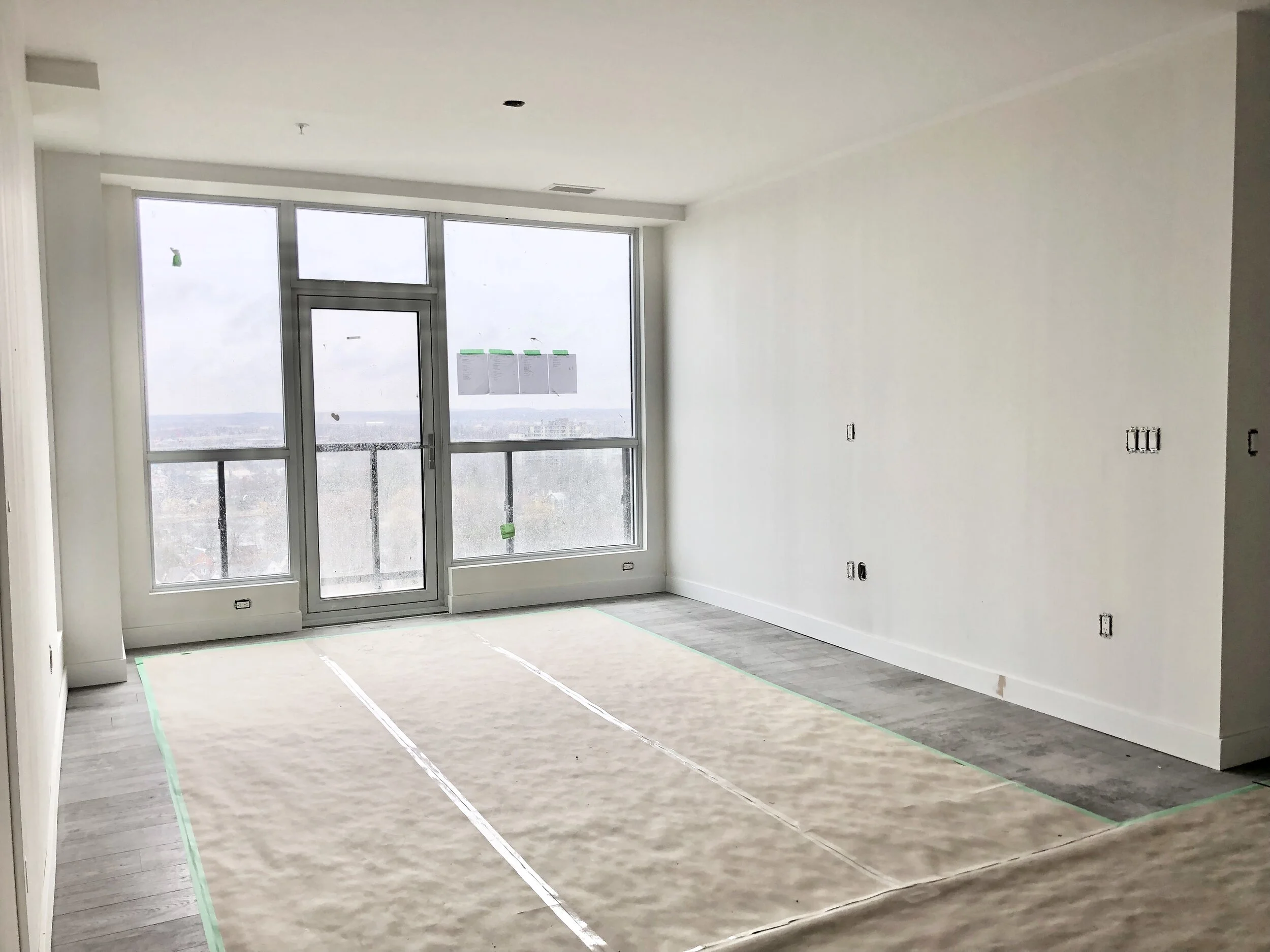
To kick start our reveal, this was how the condo looked like during my first visit. Drywall was up, wiring was in, and I knew this view would soon take my breath away. Well, it did just that!

This is the first view you see the moment you walk into the space. I want it to feel spacious yet intimate, casual yet sophisticated. We put so much attention on every detail and carefully selected all the elements that went into the room to ensure the finished living room / dining room / kitchen is exactly what we have envisioned. We want this space to reflect who we are at the moment, but also be able grow old with us for years to come.

Before I show you the new kitchen, here is a reminder of the original layout proposed by the builder and what our kitchen would have looked like without customization.


I worked with Tiffany of Tiffany Leigh Design to reimagine the layout so the builder could construct the kitchen based on our plan. You can read about my reasoning of the layout change in Week 3. From plan and elevation drawings to construction and reality, our new kitchen came in flying colors and exceeded my expectation!


With a lot of planning, negotiating, following through, and not accepting second-best, we managed to check off our entire must-have list:
feature wall for an amazing design moment
full height upper cabinet to maximize storage (I promise to give Chris the storage I took out to create the feature wall)
singular horizontal line (valance, range hood, floating shelf) for a sleek contemporary statement
keep kitchen appliances out of the spotlight without breaking the bank (custom cabinet panels on appliances was not within the budget)
Let’s start from the feature wall (my favorite spot in the kitchen). This was our game plan and during construction:


Here is how our feature wall looks like now: Casual, with streamlined contemporary design. I know it sounds cliche, but I feel like I have been transported to the Mediterranean where warm breeze and the scent of citrus garden fill the air.
Color Play:
For a sharp modern statement, I have paired the light wood cabinets with matte black hardware throughout the kitchen. The combination of round knobs and the rectangular bars creates a geometric vibe; an element I repeated throughout the space.
Mod Effect:
The bold wall sconces from ANONY are simple in silhouette but extraordinary in design. Slightly over-scale / unexpected, I love the drama and intensiveness of these big black dots!

Tip 1: create a cohesive look with accessories
Natural materials, handcrafted potteries, and layering of subtle textures add warmth, personality, and soul to this new contemporary kitchen. Every piece of accessories here were sourced from different artisans / local stores, and yet they work together for a cohesive story despite of their differences in shape, color, and material. My rule of thumb in achieving this goal is selecting items with similar design aesthetic.
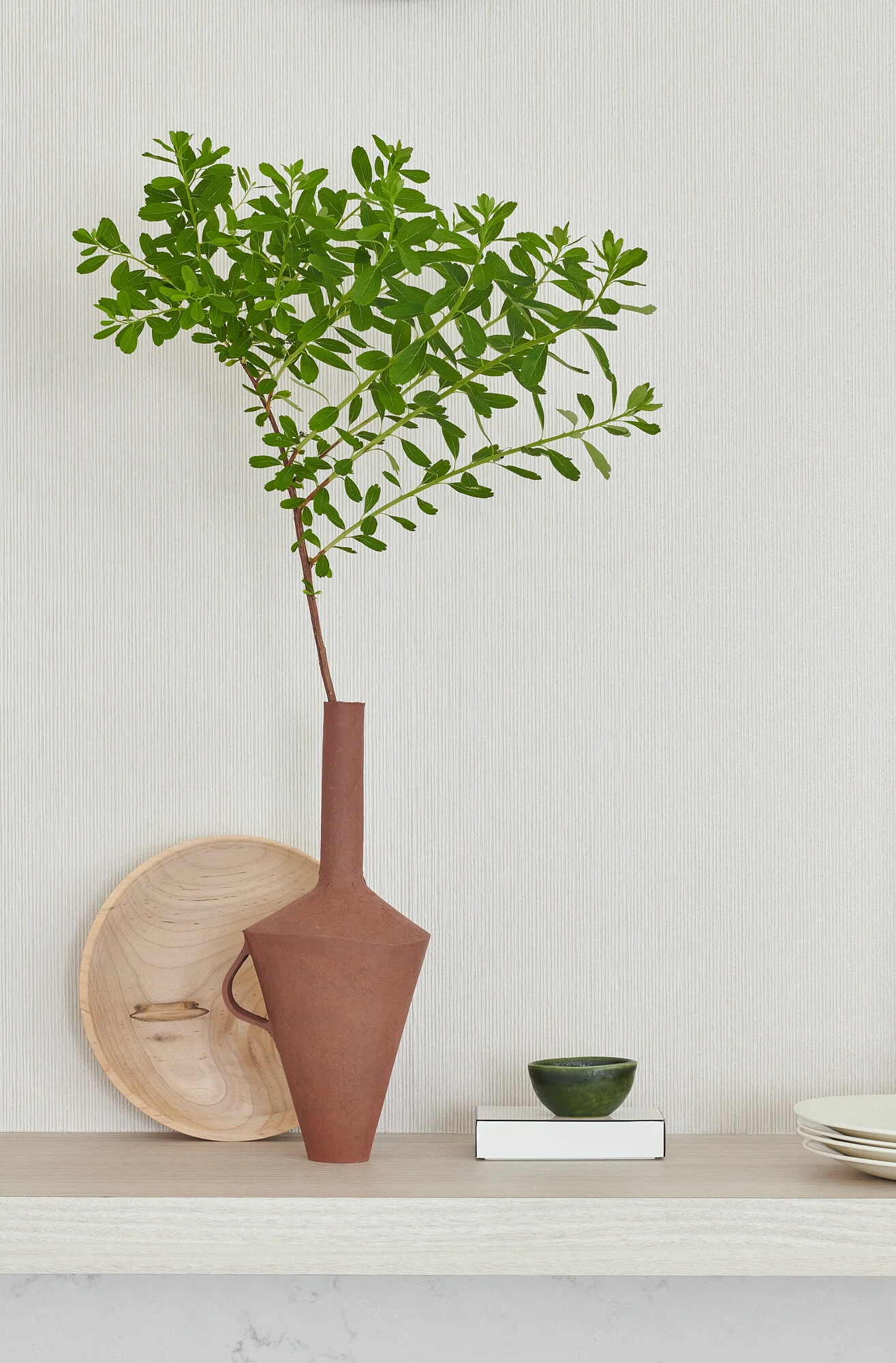
One of my favorite pieces is this handmade / hand painted vase from Jill Rosenwald. As the only pottery with pattern, the various shades of mauve + the wave inspired motif really stand out. Chris and I adore this spectacular vase and I am sure you will see it shining in different part of the condo in the future.


To make the feature wall really shine (literally), we have installed this stunning grasscloth wallpaper (PDZS115 from the Zhen Shi collection) from Pacific Design International for an extra layering of texture and the subtle metallic quality reflects natural light beautifully. It also provides the perfect backdrop to showcase our treasured accessories.
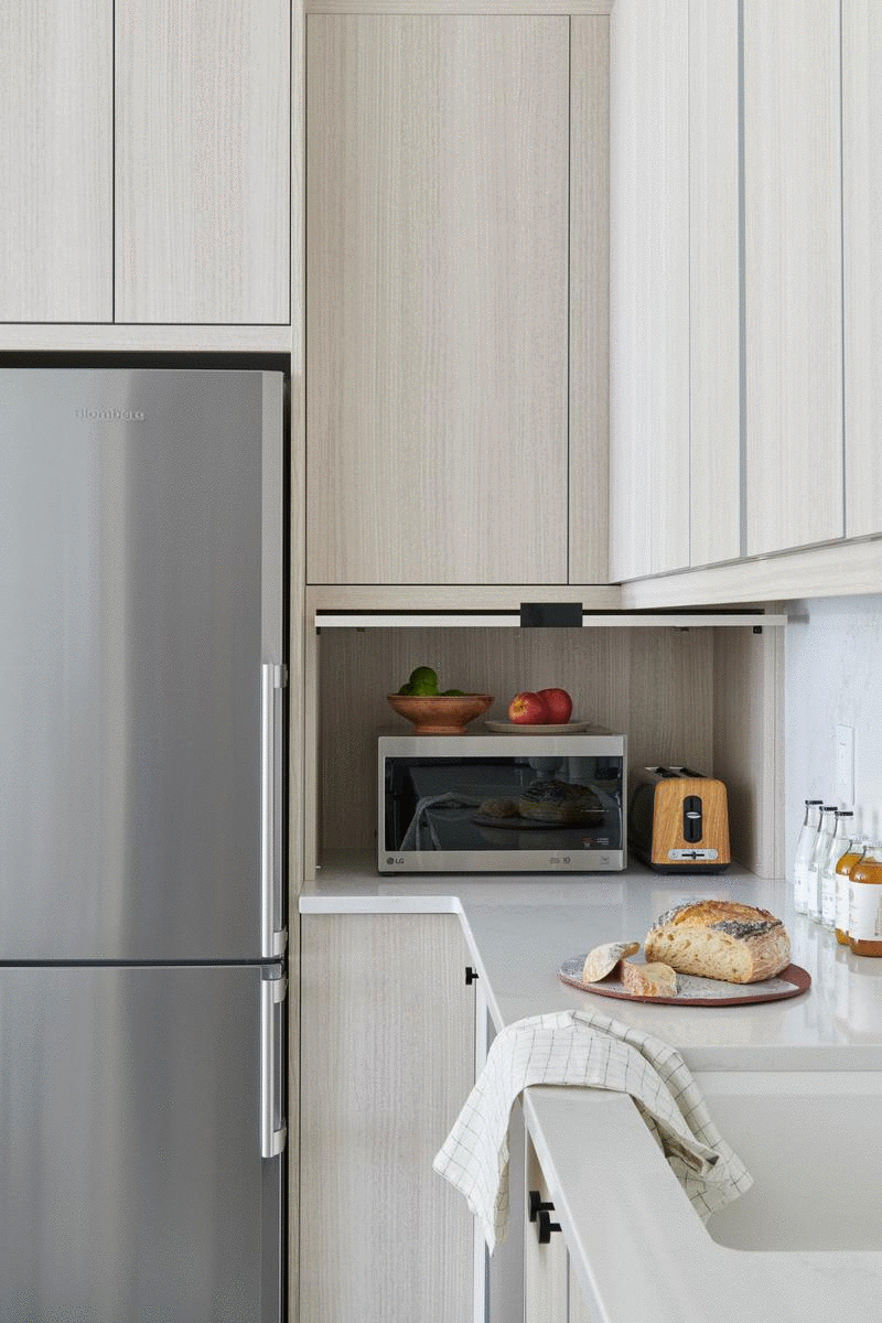
Up next is storage and how I “hide” some of my key appliances. By turning the fridge and backing onto the side wall, I was able to keep it mostly “out of sight”. This location shift created an opportunity for me to add a custom cabinet to conceal the microwave while keeping it easily accessible. From plan to reality, it was a lot of work but it absolutely paid off!


Tip 2: select hardware to complement your style
I debated on what hardware to use for the microwave cabinet. I want the cabinet to look as seamless as possible. My go-to hardware is push latch for its minimalist appeal, and that’s what we have used for all the upper cabinets. However, due to the size of the door (considering its weight) and the practicality on how to open the door, hidden pull is the obvious choice and the stylish EDGE pull in flat black from EMTEK came to the rescue.

Next, determined to create a designated “dining room” without sacrificing square footage and interrupting flow, I decided to place the dining table in the middle of the walkway, to redirect traffic and optimize the layout. It is also an attractive first impression the moment you walked into the space.
Here is a tip on how to give your dining table a fresh new look. Can you believe our dining table used to be a live edge dining table?
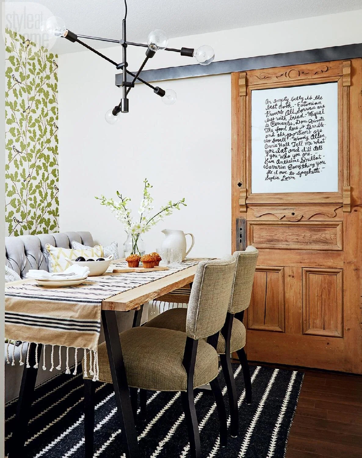
image via Style at Home courtesy of Donna Griffith
Tip 3: slipcover your dining table
We love our table, but the raw untreated wood surface is not a practical choice given it is now doubling as an extended counter space. Since we planned to install the stunning Montauk from HanStone Canada for our kitchen countertop and backsplash, I thought why not order some extra quartz to give our table a a new outfit. It is deep enough to fully disguise (and protect) the original wood top and finished off with simple mitered edges. More behind-the-scenes on the quartz process in Week 3.
Thank you, HanStone Canada, for partnering with me on the project. Our kitchen wouldn’t be complete without the handsome and durable Montauk!
floor covering in kitchen
This is just a hot debate!! Aside from whether it should be tiled for practicality or just wood floor continues throughout and not visually chopping up the space (especially in open-concept, small space living), I have taken the conversation one step further by having a gorgeous hide rug from Couristan in my kitchen and here are my reasons:
by selecting a rug that’s just the right size for the dining zone in close proximity to the floor in the color department means the rug literally seamlessly blends into the vinyl flooring (no more chopping up the room)
hide rugs usually have short pile height meaning they usually don’t trap dirt and if you do spill something on your rug, you could quickly soak it back up with paper towel or with a vacuum (we did exactly that yesterday so we can attest to the theory)
this rug has a gradual color variation from dark grey to creamy white, which echos the color palette of the entire room and matches perfectly to our cabinets (not to mention how nice it’s to rest your feet on this rug)

A couple of style moments in the kitchen. I love the vibrant orange accent for a touch of summer delight + who would like to join me right here for breakfast or afternoon tea break?


One more before and after of the kitchen / dining room before we head to the living room. It was so worth all the headaches and sleepless nights and now the kitchen is done!!


Are you ready to take a look at the living room? We have come a long way since its humble beginnings. The transformation is night and day, and we managed to do it without any structural changes. Some smart space planning during the early phase really paid off. More discussion on the room layout on Week 2.


I knew the view was going to be key the first time I stepped into the condo.

The hallway gives the living room its grand entrance moment (which doesn’t happen often in condo living), and I intend to celebrate this unique opportunity with these foundational elements:
Wall Covering
The gorgeous grasscloth wallpaper (PDSZ4018 from the Shenzhen collection) from Pacific Design International has completely elevated the elegance and luxurious level of the room. The subtle color variation from the natural grass and the textures from the weave simply can’t be achieved with paint. It adds warmth and depth to the walls. By wrapping the entire space with wallpaper, we have magnified its stunning effect and have created a cozy, cocoon-like retreat.
Floor Covering
This sumptuous handcrafted hide rug in a herringbone pattern from Loloi (available via Rugs Direct) introduces a dynamic yet delicate motif, and it works harmoniously with all the elements in the room. The soothing grey and cream color way is consistent throughout this 8’ x 10’ rug, which is very rare when it comes to hide rugs. The combination of luxe viscose and hand-stitched leather adds dimension and makes it super soft to touch.
To visually “expand” the rug a slight bit for better coverage of the floor, I have put our black and white rug underneath the new Loloi rug and I am thrilled how well they layer together.

Statement Floor Lamp
Let’s take a moment to admire this sensational floor lamp from Hudson Valley Lighting. I debated a little while whether it would be too large for the space, but I am glad I went with my gut feeling because scale is exactly what I need to counter the 44” wall sculpture from Ridgely Studio Works. The aged brass finish, the rattan detail, the shape of the Belgian linen shade, I simply couldn’t love it more!
Stylish + Practical Hardware
I also love how brilliantly the the classic silhouette of the floor lamp juxtaposes against the sleek modern vibe from the Adorne dimmer switch from Legrand and the flat black helios door handle from EMTEK. It’s all about mixing and matching different styles for a tailored, curated look.
The touch tru-universal dimmer features a translucent face and a similar operating experience as an iPhone. The powder white wall plate with its matte white finish has totally taken the light switch to a whole new level. The radiant receptacle with ultra fast USB charger keeps all my devices fully powered with a much cleaner look. No more good old plug-in chargers!
Solidly constructed, we knew the helios lever handle is of top quality the moment we held it in hand. The handle is smooth to touch and its weight (not heavy by any means) just feels so nice “to handle”. Coming in a variety of finishes and rosette options, I am so happy with how the angular lines of the rectangular rosette contrast the circle motif throughout the room.


Decorative Pillows
By keeping all of the fixed elements (walls, sofa, chaise) in neutrals, we have the opportunity to play with patterns and colors that are easy to change to match with our palette / taste over time. It’s far easier (and economical) to switch up pillows than to reupholster the sofa after all! Now when it comes to pillow, I always design mine with two different looks (front and back) so they are most versatile to decor update.
I have partnered with SWD Studios on this gorgeous rectangular number with Graffito by Kelly Wearstler in linen / onyx one on side and Kubus Argent by Pierre Frey on the other side. As you can see, they both offer ample personality but have a completely different vibe. All I did was to flip the pillows and voila, we have a whole new look! Handmade in Toronto, the knife edge construction and the invisible zipper closure are done to perfection. I can’t wait to work with Susan for more pillow updates in the next One Room Challenge!
I also love the looks of the square pillow and how they complement the overall pillow scheme. Here is another tip on how to create a semi-customized pillow. I started with the Chalet embroidered pillow from Evia Mae & Alex Designs. It has a solid creamy linen back and since I am crazy about the amazing amber from Trend I thought, why not just add a shot of vibrant amber to the linen backdrop for a whole new different look?
Everyone loves that pop of green when I shared my palette on IG and I couldn’t agree more! Check out this silk blend pillow by Missoni Home I found at HomeSense. It is so luxe and I love the subtle sheen. Wish there was a second one - I will keep looking!

Pre-construction projects are full of surprises. However, not all surprises are bad and here are couple of good ones we discovered when we took possession of the unit.
Surprise #1
This little narrow window was not in the original drawing and I am glad that it is here. It offers another window to the beautiful view and to let in additional natural sunlight. My initial plan was to install a single drapery panel for a decorative touch … and to match the large window. However, after looking at it long and hard, I decided to treat it as an architectural feature instead of a “window”. It helps visually extend the living room and it also allows me to yet again create another picture perfect moment.

The white oak pedestal with slate design is a custom piece by Jordan Poirier Furniture. Based in Toronto, Jordan’s aesthetic, his attention to detail, and his amazing craftsmanship caught my attention at the Interior Design Show two years ago. Since then we have worked together on a couple of projects and I knew he’s my guy once I had decided to make a streamlined, refined pedestal … wait for it … with STORAGE!
Yes the front actually opens up and the two adjustable shelves give me additional storage to house vases / accessories.
I am also obsessed with the pillow play at this corner. I have paired a custom round pillow (latte, acorn from Calico, emerald, pesto giorgio from SWD Studios as buttons, and simple stripe as banding from Tonic Living) with a square pillow in Kelly Wearstler Avant in Linen from Pillow Splash Studio on Etsy.

Surprise #2
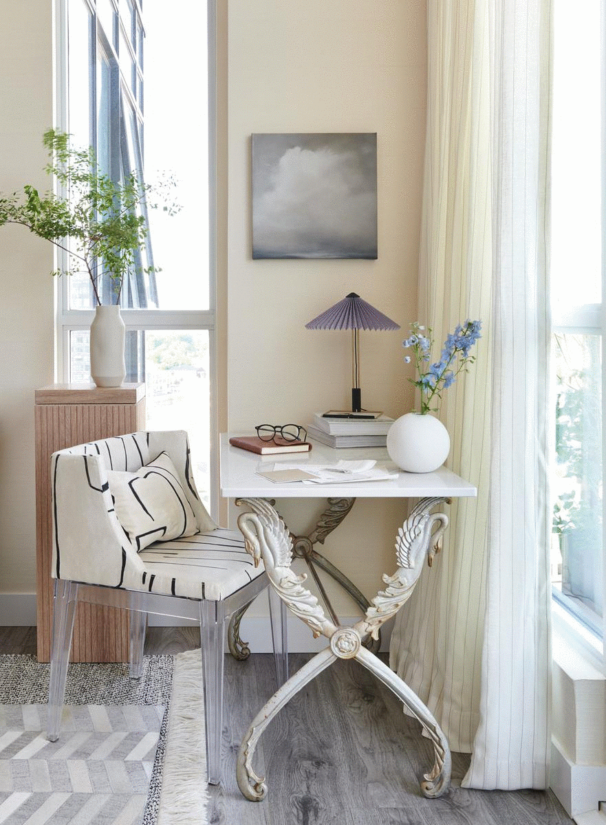
Another nice surprise is this little bump out at the corner. It created a natural spot for me to set up an impromptu office zone for me to write a card, coloring, or simply be inspired by the view.


Stay Green
I want to take this opportunity to celebrate the fabulousness of preloved treasures. Both the swan desk and the Mademoiselle chair by Phillip Starck were scored at my local antique market. The swan table came with a glass top and I have opted to use a piece of remnant Montauk from HanStone Canada to complete the look. The chair was upholstered in a bold floral and I was able to make use of my leftover Graffito to give it a fresh new look! Best of all, we were able to give these pieces a new lease on life and help out our planet one treasure at a time.
I also want to show you another pillow play here thanks to SWD Studio. I love how chic the full Graffito lookswhile the Kubus Argent adds drama at this french inspired corner.
Window Covering
While we are talking about the transformative power of fabrics, I would like to introduce you to Montauk Pinstripe from Tonic Living. Effortlessly elegance is exactly how I would describe this light and breezy sheer fabric. Backed with muslin lining, the drapery panels now have structure and they also help filtering bright morning light. I have used this exact same fabric in the office last Fall. Totally obsessed with how good they look, Montauk Pinstripe simply had to make an encore appearance in the living room.
And once again, can I just tell you how much I admire the amazing grasscloth wallpaper from Pacific Design International?

The final stop of our reveal is the lounge and the gallery wall. My goal was to create a serene and relaxing retreat to rest our hectic minds and be inspired by our surrounding, whether it’s the view from our condo or the artwork that’s special to us.

I want to put the chaise at this corner because of the view and also because I really need to get this handsome chaise by Sarah Richardson out of the storage. I expect the chaise to fit along the window per builder’s plan. But one can never be too sure until the measurement is confirmed on site. To my relieve, the chaise fits like a grove and not an inch to spare!
We also have a little space between the drapery and the chaise for a sleek floor lamp from Mitzi. What I love about the Layla floor lamp is that she exudes a dynamite presence without taking up any square footage. Chris was so excited about his new lamp he immediately put it at the corner, sat on the chaise and read the first chapter of his new novel. I’d say that’s a win!

Layered Texture
Chaise Lounge
I couldn’t believe how different and how stunning the chaise looks with a new outfit thanks to Calico. As mentioned in Week 4, I have paired the sophisticated Bale Mill Canvas performance fabric from the Ralph Lauren collection with a buttery Luciana faux leather for one incredibly stylish yet super durable chaise to enjoy for years to come.
Whimsical Touch
My room isn’t complete without a little bit of fun and this feather ball just makes me happy every time I look at it. It took about 23 yards of feather trim from Trend and some long hours of hand sewing, but we simply wouldn’t be able to achieve the same effect with fabric. It also add an element of softness to the room.
Luxurious Comfort
The blanket goddess blessed me again with a beautiful Alicia Adams Alpaca throw in a mini herringbone pattern in cognac and I found it at HomeSense Canada for $150! The super soft baby alpaca keeps me cozy in the evening and the color way is a pure serendipity match for the space.


Artwork
I shared with you my tips and tricks on creating a salon wall on Week 2. By narrowing down the selection to 8 pieces, we have kept the wall feeling light, minimized the number of holes on our beautiful grasscloth wallpaper, and curated a special collection with limited edition prints from minted (full list with direct links below), a few screen prints from my dear friend and talented Toronto artist Alanna Cavanagh (check out her shop at the Toronto Online Art Fair from July 2-12), and a cheeky monkey by Gray Malin.
Styling
I often struggle with styling. I need to constantly remind myself less is more, select only special pieces, give them room to breathe, and let their natural and sculptural beauty do the narrative. In this case, the main focal point on the credenza is this one-of-a-kind sculpture from Montana Labelle Design. I love its texture and how the tribal sensibility adds so much character to the vignette. A mod refined round black dish + a vintage marble ball create an instant tension against the rustic quality of the sculpture.

Last but not least, this striking 3-Tier Orbital Chandelier from Blueprint Lighting is one of the key elements that totally makes the room. Visible from every direction in this open-concept space, I want a showstopper fixture to anchor, but not overpower, the room. It is airy, sculptural, and handmade to perfection. This chandelier 100% fits my wishlist and Blueprint Lighting wins my heart by customizing the fixture in a matte black finish + spraying one of the counterweight globes in Dusk to echo the other mauve accents in the room.

I can’t believe we are coming to the end of One Room Challenge Spring 2020. I have met a lot of new friends though this welcoming, inspiring, and supportive community. Renovation is never smooth sailing and it certainly was challenge to complete one during this unprecedented time. Thank you so much for all your encouragement, laughter, and ingenious advice along the way to make this One Room Challenge truly a unique and most rewarding experience.
Feeling a bit like a graduate from the Class of 2020, featured designers + guest participants we did it!!
p.s. I really need a haircut … COVID 1 | Tim 0


A Glass of Bovino | Beginning in the Middle | Beth Diana Smith | Clark + Aldine | Coco & Jack
Deeply Southern Home| Design Maze | Dwell by Cheryl | Erika Ward | Home Made by Carmona
House of Hipsters | Hunted Interior | Kandrac & Kole | Kate Pearce | Katrina Blair | Liz Kamarul
Veneer Designs | Rambling Renovators | Renovation Husbands | Studio Plumb | Media BH&G
A big thank you to the amazing official sponsors for making our dreams come true. We wouldn’t be able to transform our rooms without your support!

Thank you for joining me on this journey and I look forward to seeing you again in the Fall One Room challenge!
source list
accessories
Jill Rosenwald: hand painted pottery
Montana Labelle Design: white sculpture
HomeSense Canada: white planter, tea cups and saucers, lucite tray, green pillow, coffee table books, blanket, leather book, black vessel, fruit bowl and plates, espresso machine
JKC Vintage Decor: art deco glass cup and saucer
CB2: white round vase, small black planter
lea & Nicolas: brown vase on floating shelf, brown bud vase on coffee table
H&M Home: green bowl, black flat bowl
1925 Workbench: wood tray
Hay: espresso cups and sauces, green vase on side table
artwork
minted: folded lines by Jennifer Morehead, path of life by Kisco Print Shop, Tread by Teresa Lang
Alanna Cavanagh: big teapot, empty belly, brogue
Gray Mallin: disco nap
Ridgely Studio Works: round wall sculpture
custom work
Jordan Poirier Furniture: pedestal
Millennial Art Services: lucite art frame
Stride Design: round pillows
And Once We Were: ball pillow
chaise fabric
Calico: Bale Mill Canvas, Luciana
drapery fabric
Tonic Living: Montauk Pinstripe
furniture
HomeSense Canada: dining table
Sarah Richardson Design: sofa, chaise
West Elm: side tables
Gus* Modern: credenza
vintage; coffee table, swan table, Eames chair, black dining chairs, lucite block, marble donut
hardware: EMTEK
light switch and outlet: Legrand
adorne dimmer switch
adorne powder white wall plate
radiant receptacle
lighting:
Blueprint lighting: 3-Tier Orbital Chandelier
ANONY: wall sconces
Hudson Valley lighting: flare floor lamp,
Mitzi: Layla floor lamp
Hay: Matin table lamp
pillow fabrics:
SWD Studio: emerald, pesto giorgio, graffito in linen / onyx, kubus argent by Pierre Frey
Tonic Living: simple stripe
Evia Mae & Alex: chalet embroidered pillow
Pillow Splash Studio: avant in linen
quartz:
HanStone Canada: Montauk countertop, backsplash, dining table top, swan table top
rug:
wallpaper: Pacific Designs International
PDSZ4018 from the Shenzhen collection
PDZS115 from the Zhen Shi collection
Photo Credit: Stephani Buchman Photography